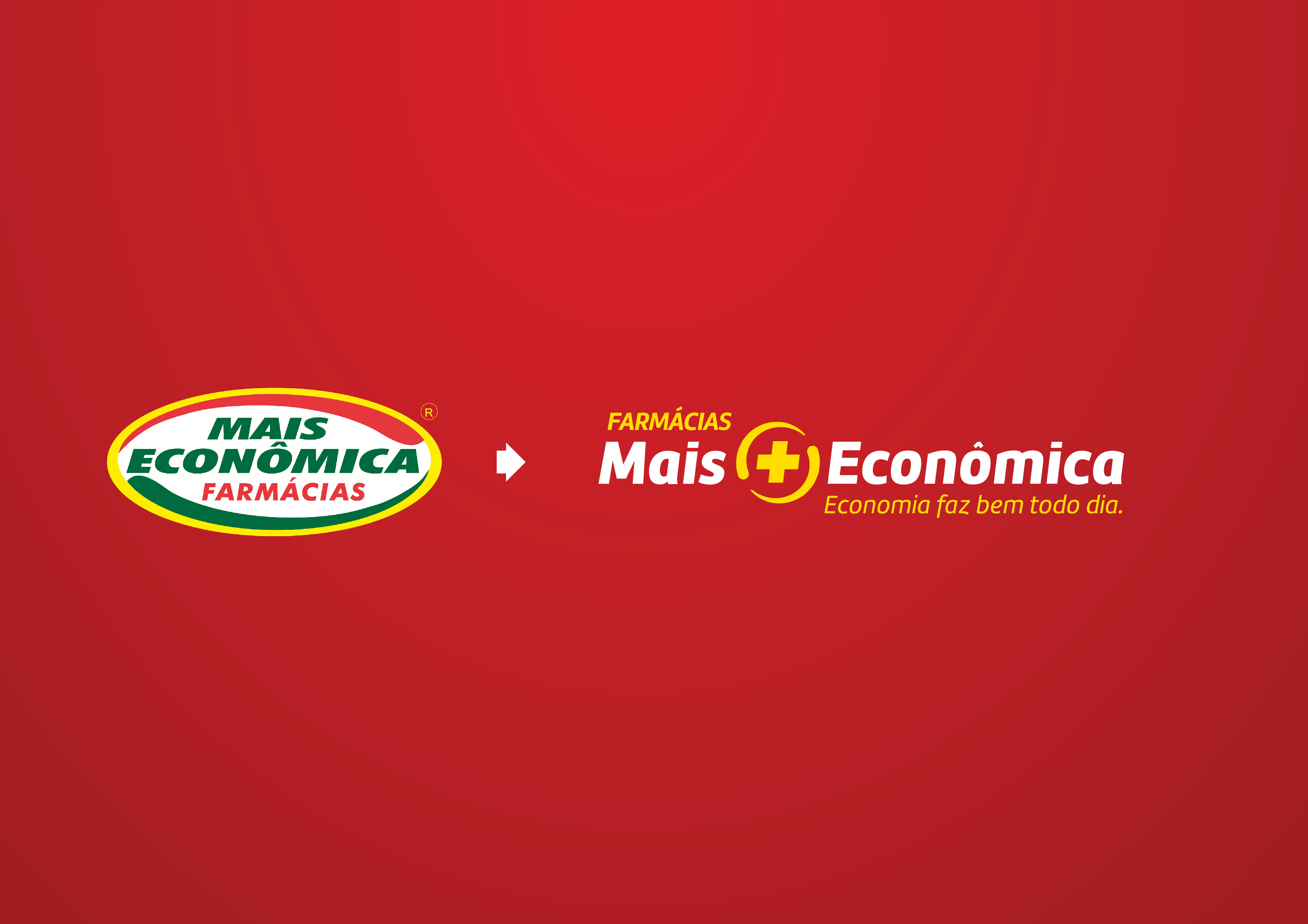
Redesign of the Brazilian retail pharmacy Mais Econômica brand. We take the red in the communication with a symbol inspired by the old brand that conveys movement, dynamism and personality to the brand. A visual support system was created.
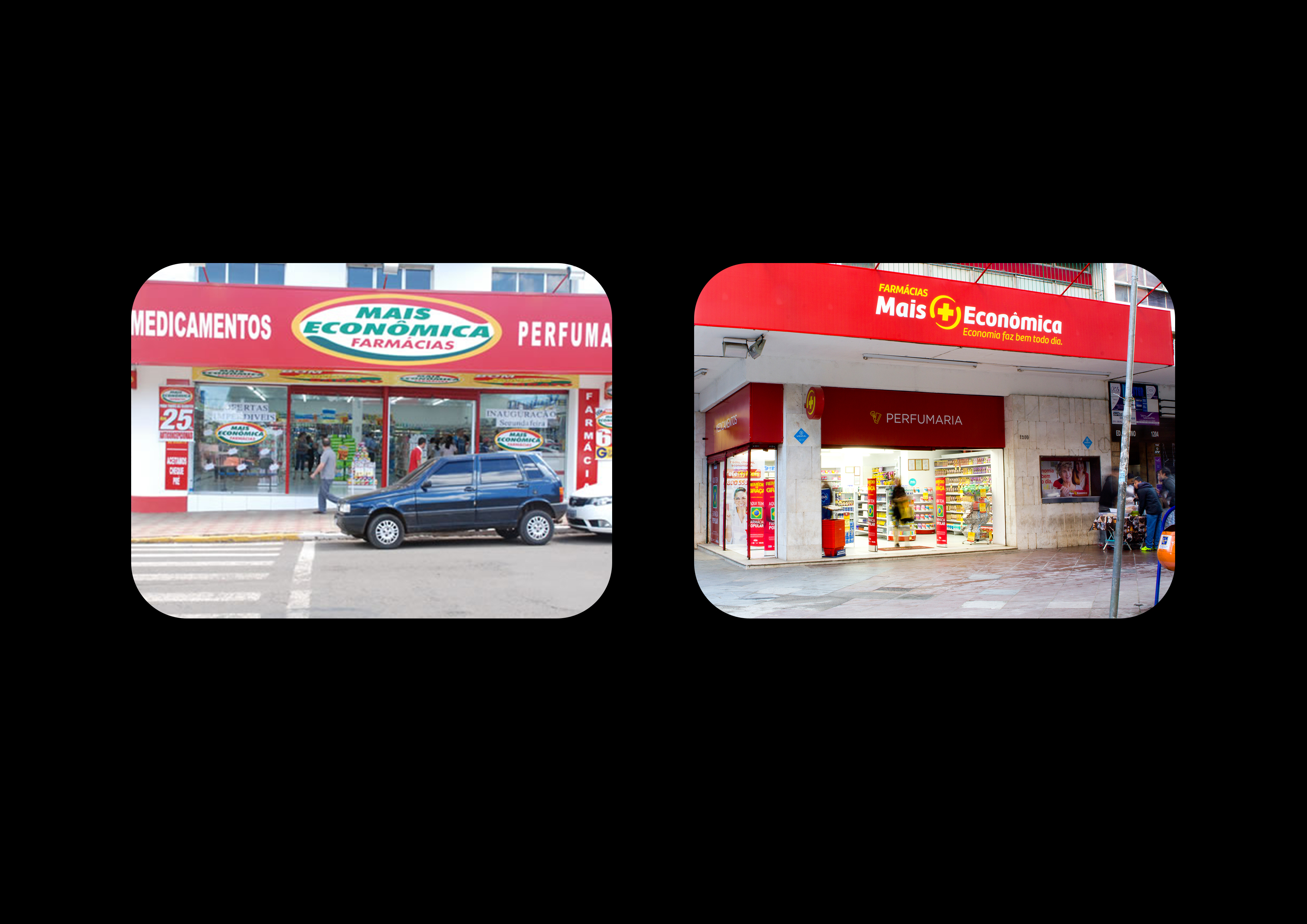
There were more than 200 stores repaginated with the new visual identity, involving a huge work of creation and finalizations of more than 1000 pieces between store signage and communication at points of purchase.